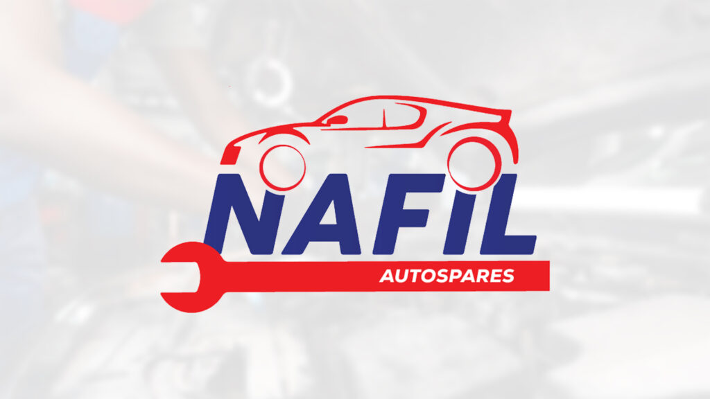
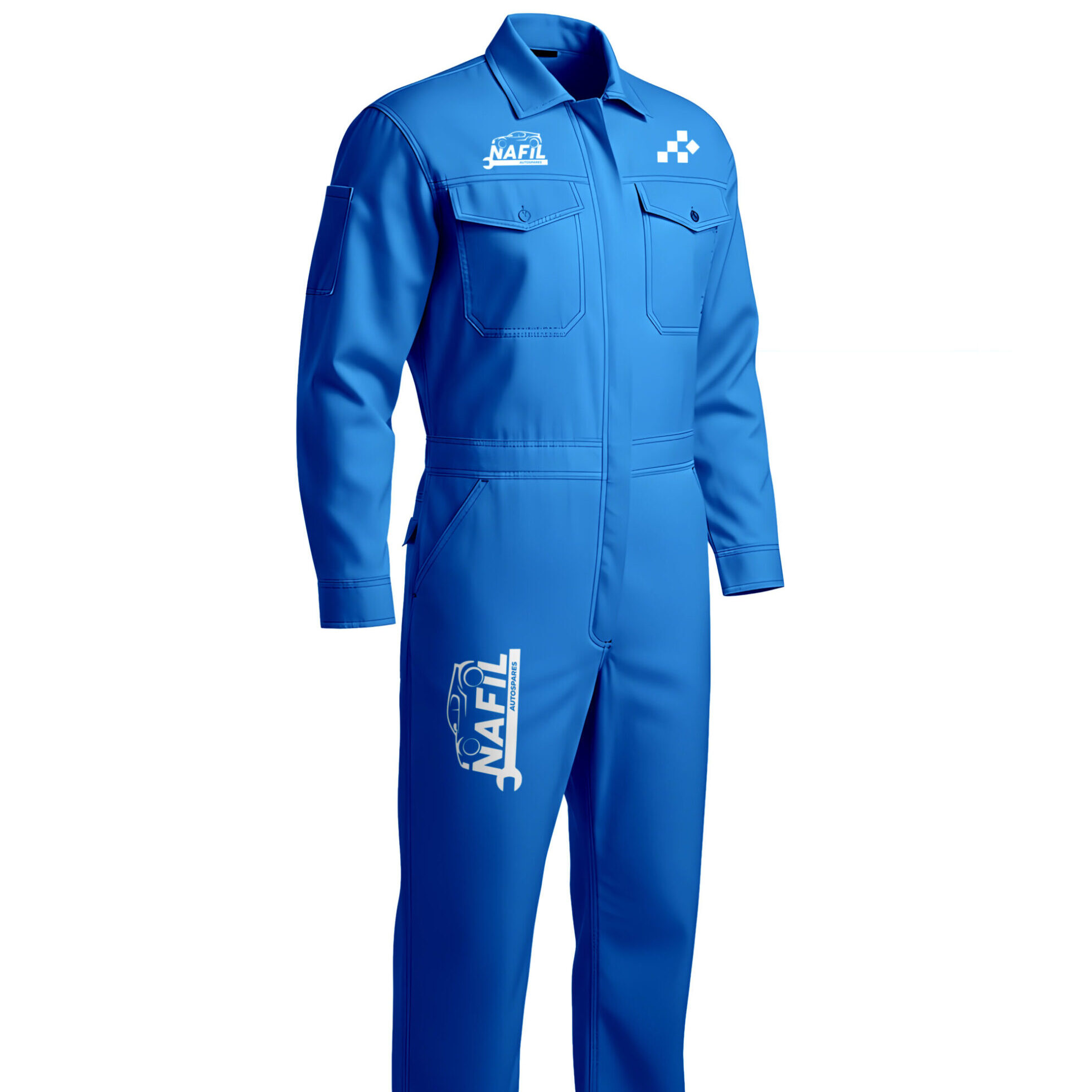
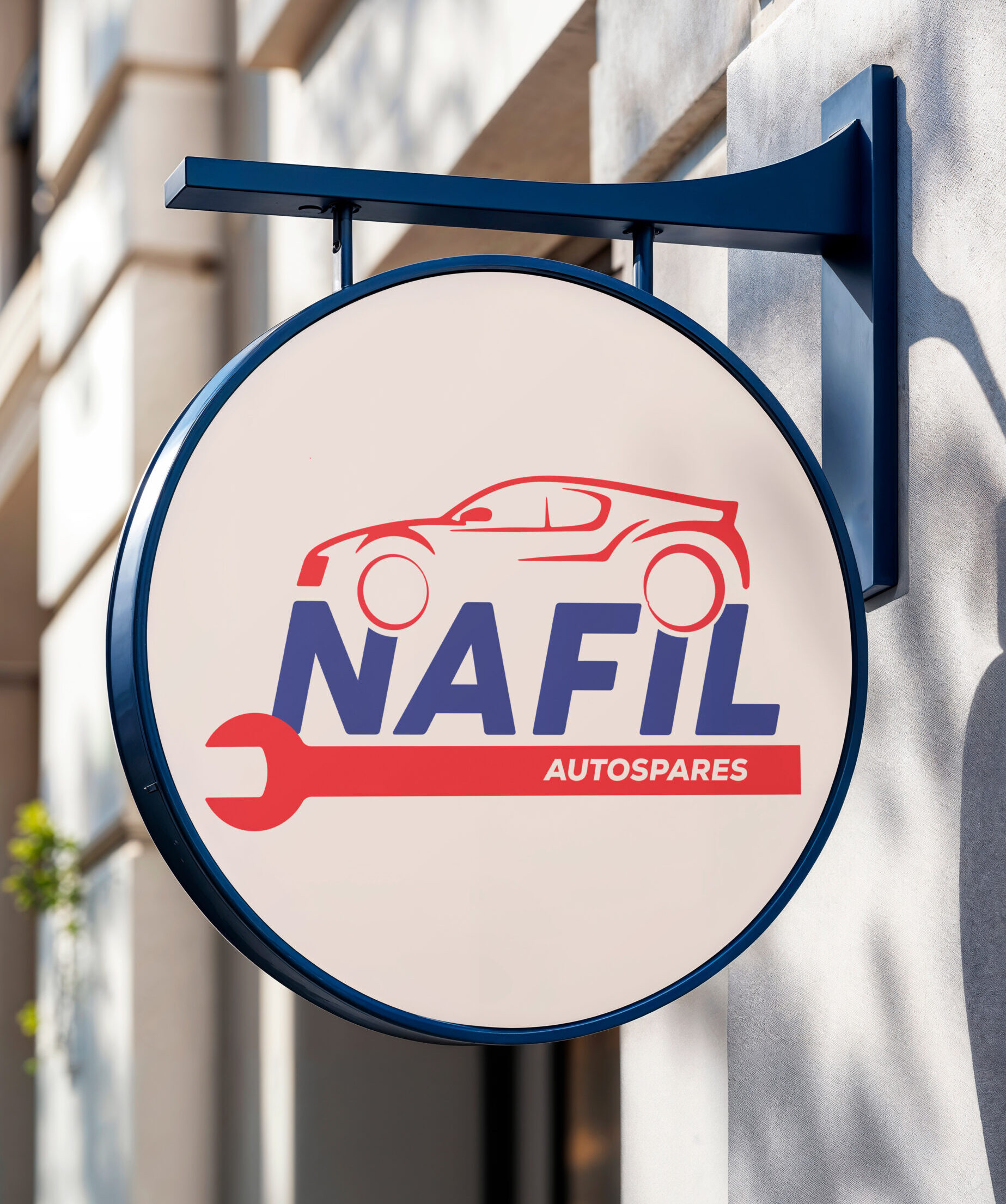
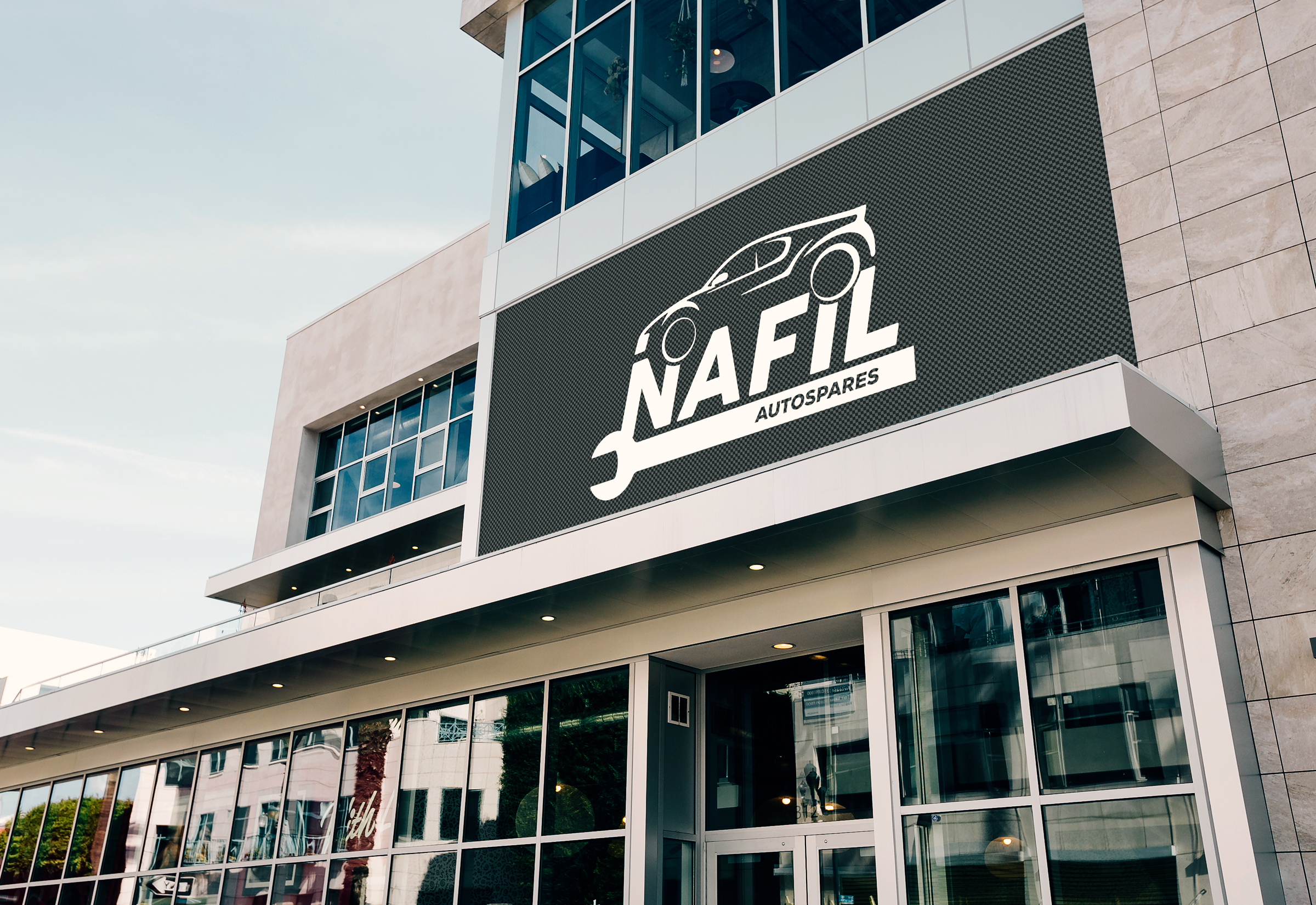
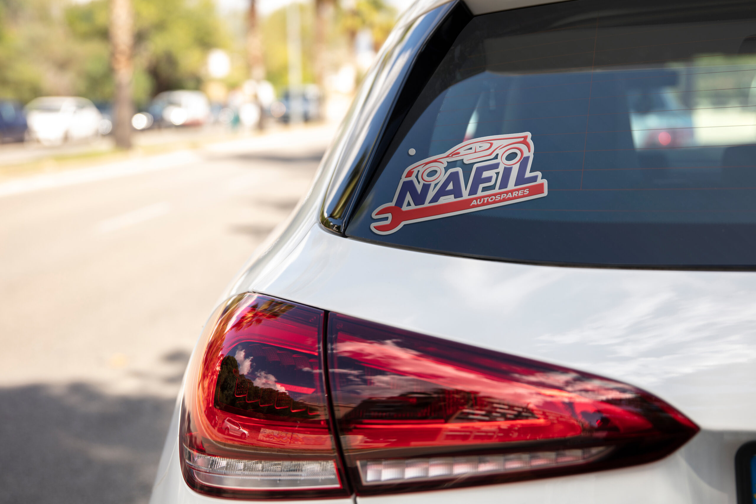
Nafil required a visual identity that could stand out in a cluttered industrial market while maintaining high legibility for technical applications like small part stamping and large scale signage
Solution :
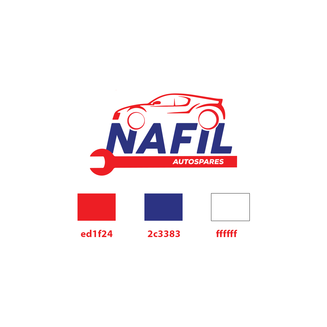
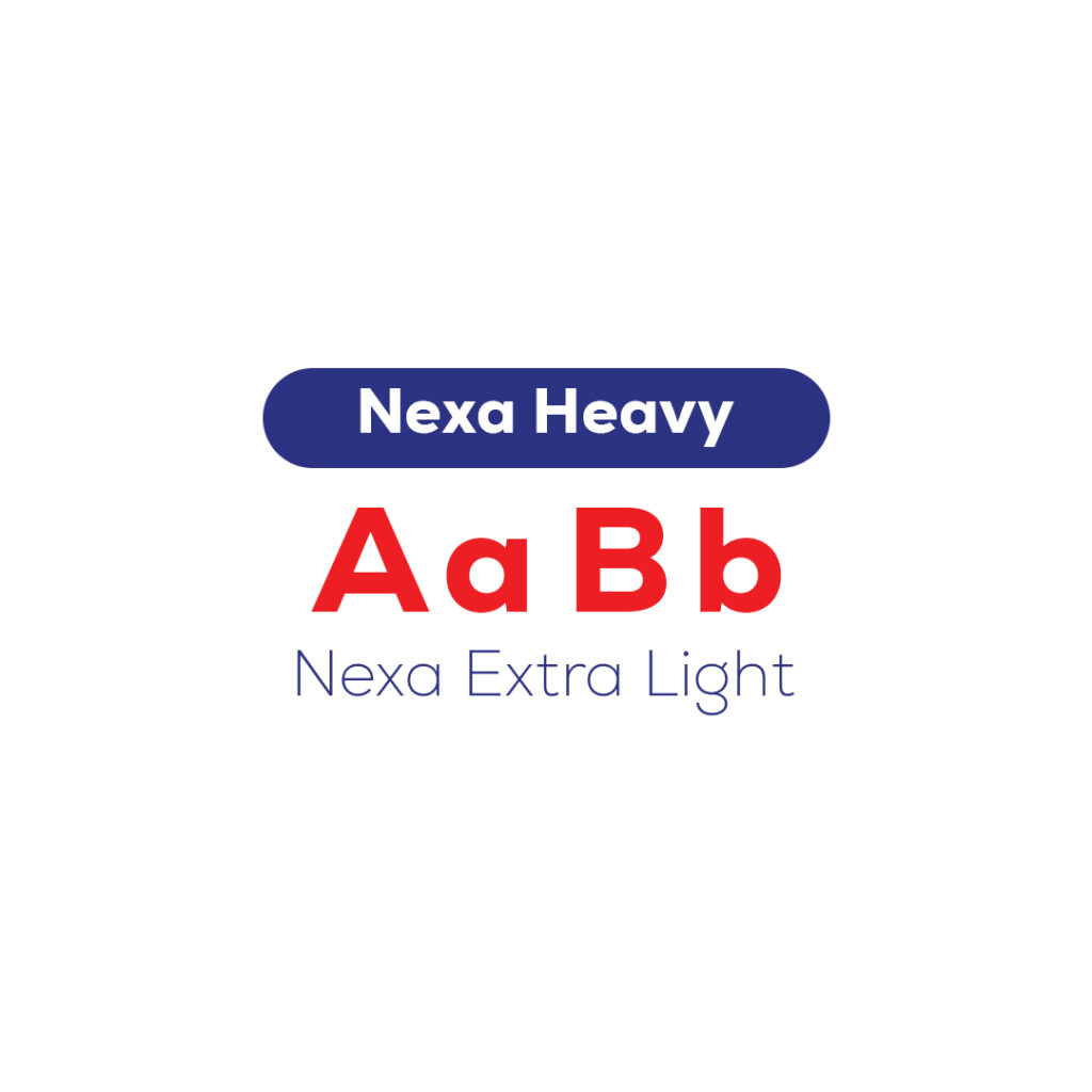
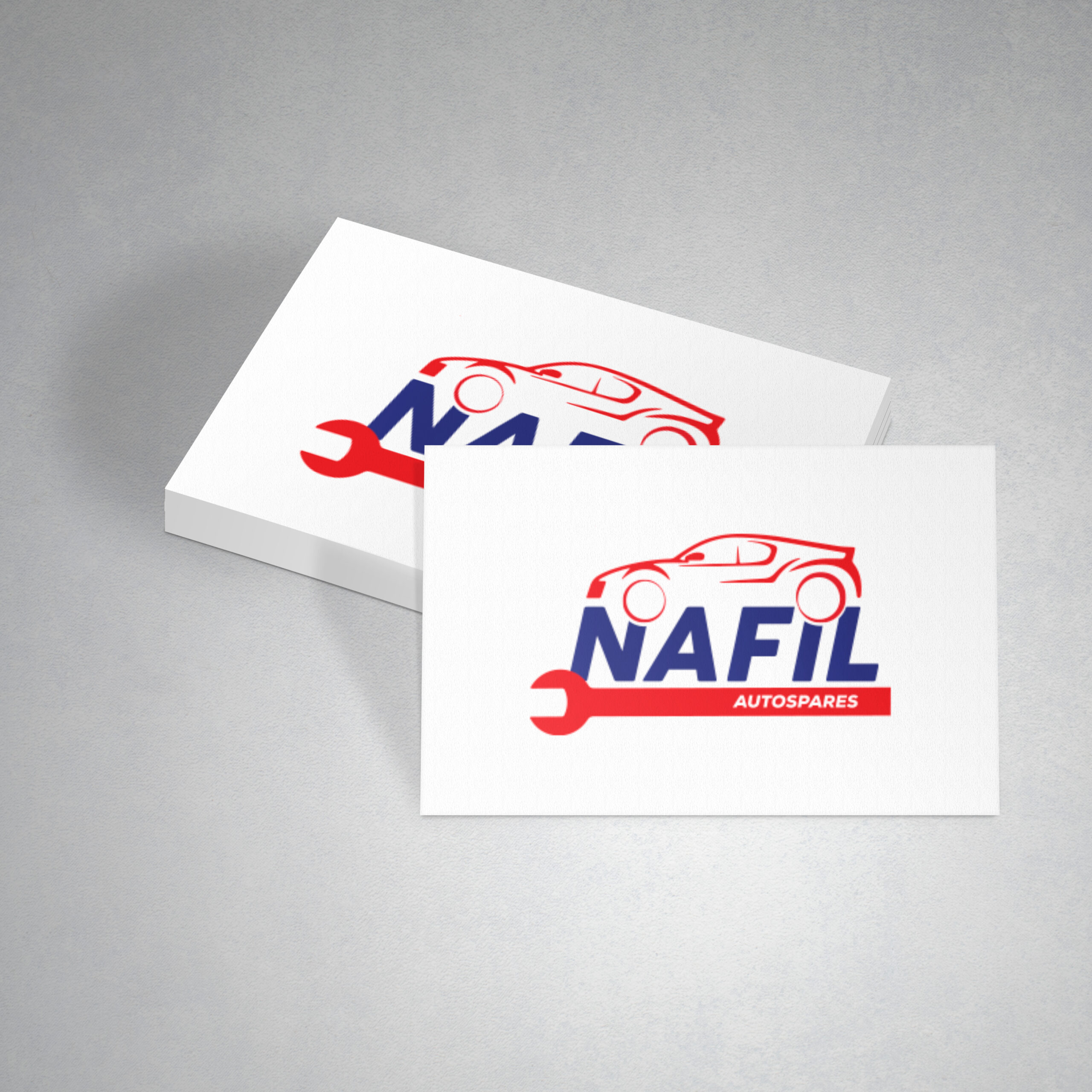
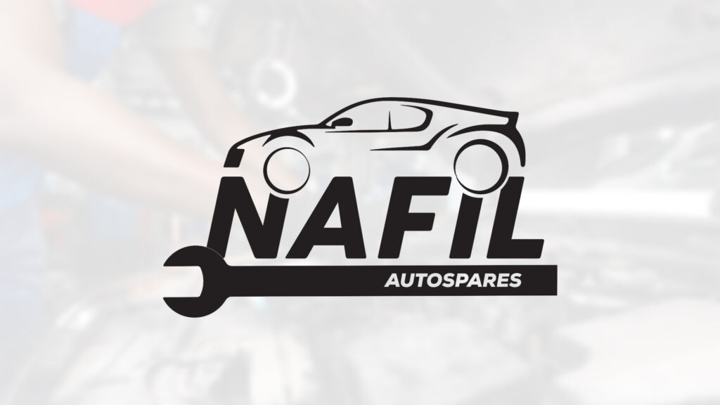
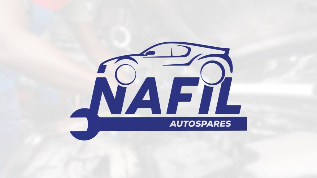
I developed a modular brand system using high contrast colors and bold typography to ensure “visual consistency and excellence” across all physical and digital platforms.
Photos
Summary :
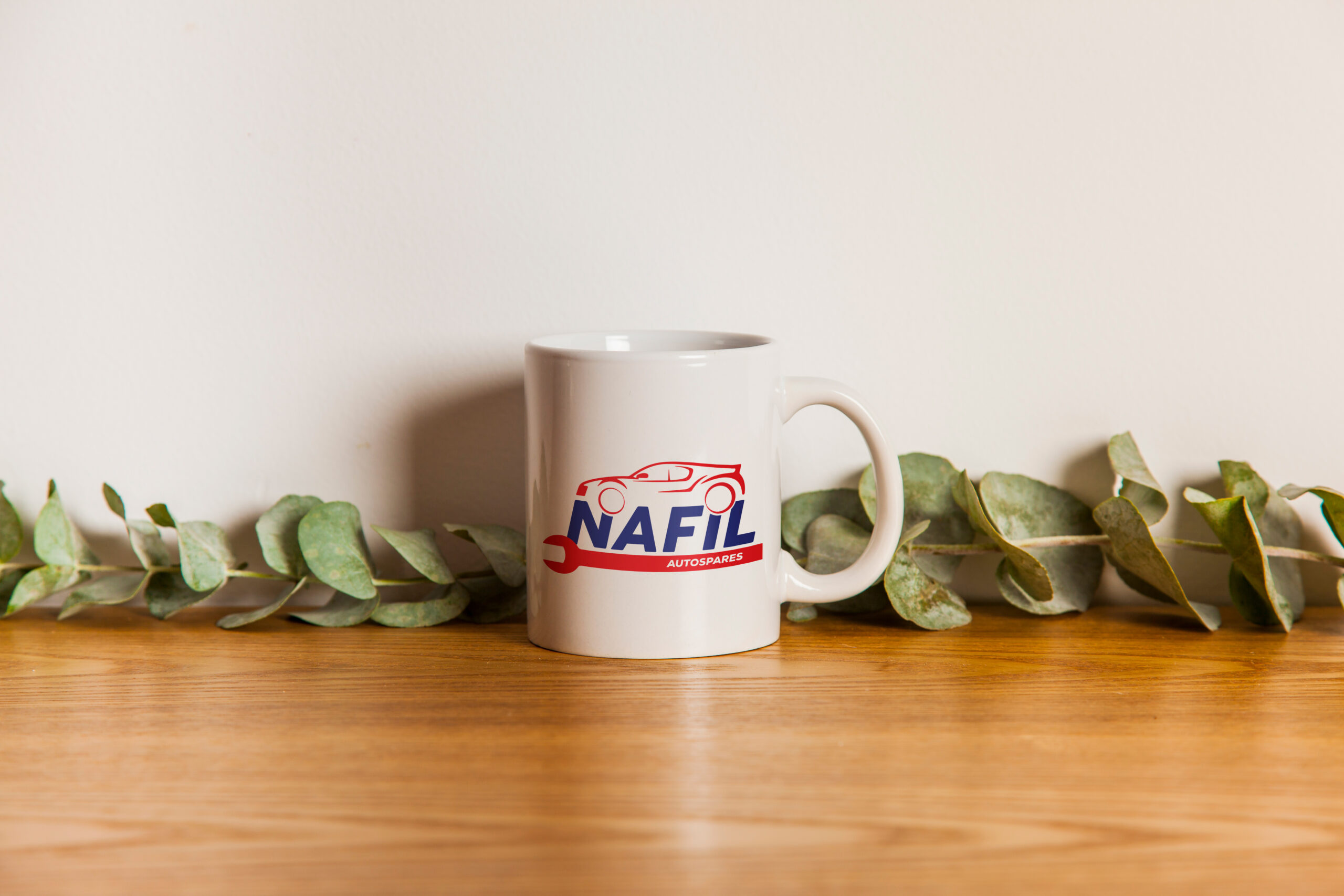
This identity was designed with a heavy focus on physical collateral (signage and stickers)